Imagine a potential customer waiting in line for a product. They pull out their phone, tap the link to your website, and wait. The screen freezes. The buttons are way too close together. The text spills off the sides of their screen. Three seconds later? They are gone, and they probably aren’t coming back.
This happens thousands of times a day across the internet, and most business owners never even see it. Your customers live on their phones now! They judge your business in seconds, and they make choices with their thumbs. A mobile-friendly website is no longer just a nice bonus. It is the literal front door to everything you sell.
What Does a Mobile-First Website Actually Mean for User Experience?
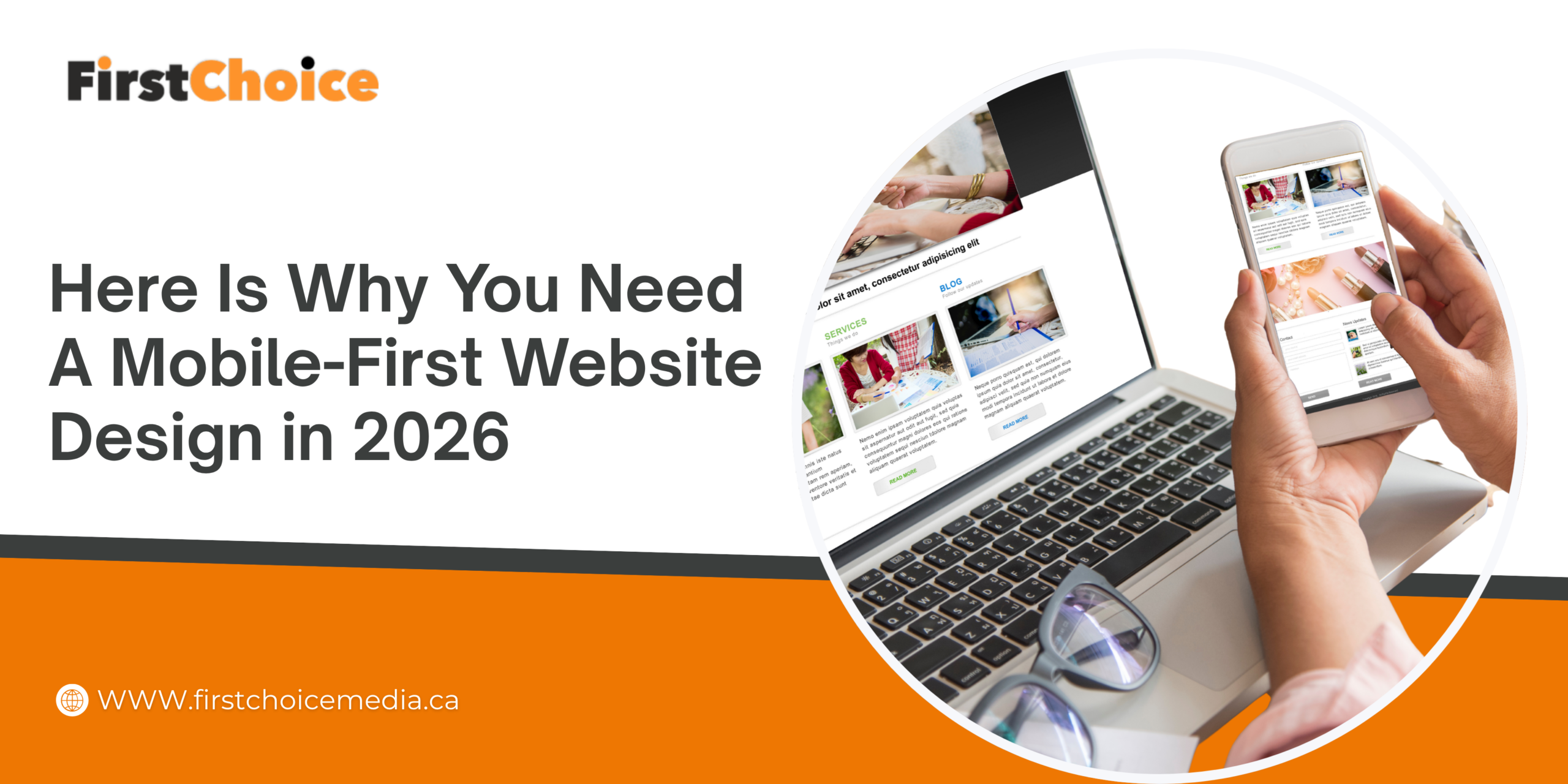
“Mobile-first” simply means you design your website for a small smartphone screen before you even think about the desktop computer version. You start with the phone layout, and then you expand the design for bigger screens.
For years, people did the exact opposite. They built websites for large monitors and tried to shrink things down later. This left phone users squinting and frustrated. Today, Google actually looks at your mobile pages first when deciding where you rank in search results. So, the mobile version, the one many people used to ignore earlier, is now the most important one!
Why Does Mobile Optimization Shape the First Impression?
Good web design answers a very simple, human question: Can I find what I need without thinking too hard?
On a phone, attention spans are short and patience is even shorter. Clear menus, large buttons that are easy to tap, and fast-loading images tell your visitors they are in good hands. Clutter does the exact opposite. It makes people feel lost, and confused people quickly leave. The feeling your site gives someone in those first few seconds often matters way more than the actual words on the page.
How Do You Build a Smartphone-Friendly Site People Trust?
Building a great website starts with page speed. Make your images smaller, clean up the messy code behind the scenes, and test your loading time on a real phone using a regular cell connection, not just your super-fast office Wi-Fi.
Smart web development also means using text that is easy to read, leaving enough space for thumbs to tap comfortably, and creating contact forms that only take seconds to fill out. Sadly, many web design companies still treat mobile phones as an afterthought, and you can feel it the second a page refuses to load properly. The brands that win make the phone experience feel effortless, almost like a helpful guide is holding the customer’s hand through each tap. If this sounds a bit overwhelming, reaching out to an expert web development consultant can point you in the right direction to fix these issues.
What Happens to Your Search Engine Rankings When You Get It Right?
When your website respects the smartphone user, people stay longer. They read more, they trust you faster, and they actually buy from you. Search engines like Google reward that great behavior with higher search visibility, bringing you more visitors at no extra cost.
Using professional website development services ensures your site is structured perfectly for this. Even AI tools that answer user questions prefer to pull information from websites that are clean and well-organized. A strong mobile foundation helps you show up in those AI answers, too. The payoff grows steadily, day after day.
First Choice Media, a full-service digital advertising agency in Toronto built for results, can turn your mobile experience into your strongest sales tool. Visit FirstChoice Media and let us help your customers stay, trust, and buy.
Call us for a quick quote on website development in Toronto.
Frequently Asked Questions
Is a mobile-first website different from a responsive website layout?
They are similar, but not exactly the same. “Responsive” means the website adjusts to fit any screen size. “Mobile-first” means you actually plan and build the phone version first, then grow it for larger screens. A mobile-first site is almost always responsive, but a responsive site isn’t always built with the phone as the top priority.
Will a mobile-first design help my Google search rankings?
Yes, absolutely! Google uses your mobile pages to decide your position in search results. A fast, clean phone experience gives you a massive advantage on the first page of Google. Expert SEO services focus heavily on this for that exact reason.
How fast should my page speed be on a mobile device?
You should aim for under three seconds. After three seconds, a huge chunk of your visitors will leave before your page even finishes loading.
Do I need to rebuild my entire site to improve my mobile UX (User Experience)?
Not always! Sometimes, making simple speed fixes and small layout tweaks is enough. A proper website check-up will tell you if a quick refresh or a full rebuild makes more sense.